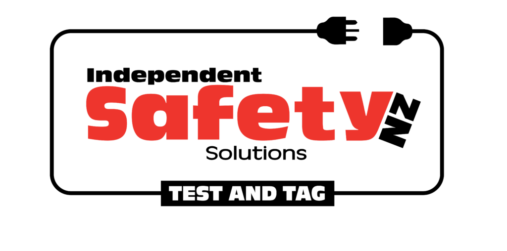
Independent Safety Solutions NZ engaged me to modernise their brand and strengthen their visual identity across all services. The project began with a full brand refresh, updating their look to feel bold, contemporary, and reflective of their commitment to safety and reliability.
The refreshed logo uses a strong red, white, and black colour palette with red highlighting the core focus on safety, supported by clean black and white elements for clarity and professionalism.